Welcome to our in-depth guide on the Grasshopper for Rhino interface. In this beginner’s guide, we’ll be exploring how to find and add components, understand their inputs, connect components, and utilize the live preview feature. So, let’s launch Rhino and get started!
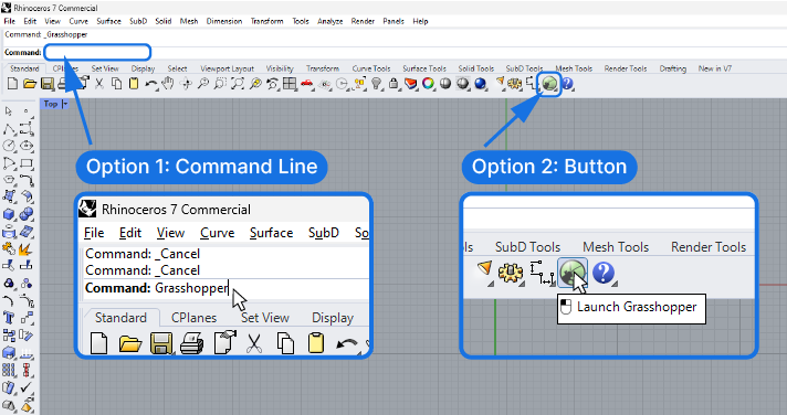
Starting Grasshopper
There are two ways to start up Grasshopper. The first, is to click the Grasshopper button on the far right of the Standard Rhino toolbar.
The second option is to type “Grasshopper” into the Rhino command bar.
You’ll see the Grasshopper loading screen and after a few seconds a new window will open. This is where the magic happens!
Setting Up Your Workspace
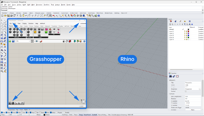
As we create our scripts in Grasshopper, we’ll see a live preview of any geometry we generate directly in the Rhino viewport. One of the benefits of Visual Programming and the Grasshopper interface is that we see the result of our script as we develop it!
To that end we’ll want to set up our workspace so we see both the script and the output side by side. This way we’ll monitor if our changes in the script have the effect we want.
So let’s move the Grasshopper window to the side of the screen, or to a second screen, if you have one.
This way we have a clear view of our script workspace as well as the resulting preview geometry.
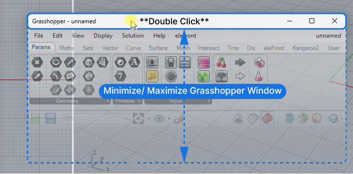
If you are using a single screen and you get a better view of the viewport, you can quickly minimize the Grasshopper window by double-clicking on the top bar of the window. Another double-click and the window is restored.
Navigating the Grasshopper Canvas
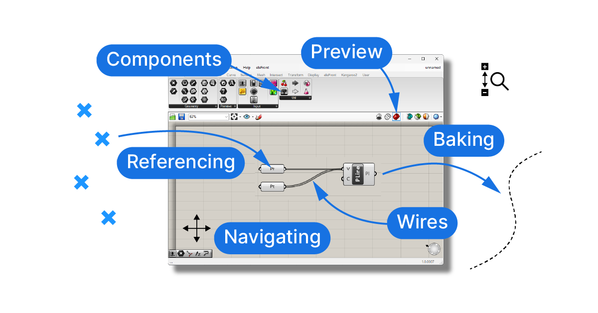
Now that we’ve positioned the Grasshopper window to our liking, let’s take a closer look at the Grasshopper interface. The main workspace for our scripts is the Grasshopper canvas. This is where we’ll place and connect our components to create scripts.
We can move and navigate the canvas just like the top view of the Rhino Viewport.
Right-click and drag to pan.
To zoom in and out, scroll the middle mouse button.
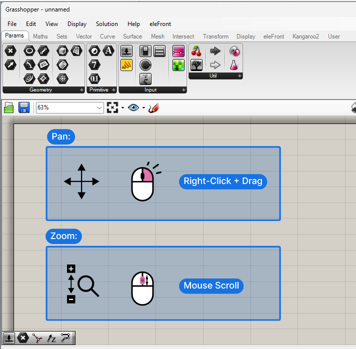
By zooming in and out we can keep an overview when needed, but also zoom in on a set of components to solve a specific problem.
Understanding Component Tabs
In the top portion of the Grasshopper interface, above the canvas, we find the component tabs. They contain all the components we are going to use to create our scripts and they’re bundled in different tabs to make finding components easier.
There are different kinds of components in Grasshopper: Some mirror the geometry-related commands we know from Rhino, others are specific to Grasshopper and help us manage data and use mathematical formulas.
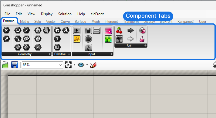
The first three component tabs: Params, Maths and Sets, allow us to interact with Rhino objects, create and manage variables and manage multiple objects with lists and data trees.
The following tabs contain the more familiar geometry-specific components. By and large these components have the same name as the Rhino commands, so as a Rhino user you’ll already be familiar with most of the commands and what they do.
Let’s take a closer look at one of these tabs:
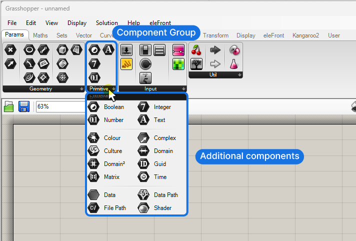
Within each tab, there are additional subsections which group the components further. If we click on the black bar on the bottom of each group, the drop-drown shows even more components, these are usually more specific and used less frequently.
Take some time to go through each of the component tabs to get a feeling for which commands are available in Grasshopper!
Adding Components to Your Script
Now that we’ve explored the basic layout of the Grasshopper interface, let’s bring it to life by adding some components. This is where the real fun begins as we start to see our designs take shape.
There’s two ways to to add components to our script.
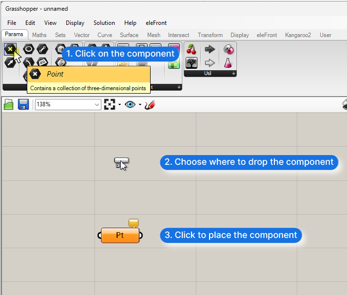
Let’s say we want to add point container component. Container components are nodes that store certain geometry, without modifying it. There are container components for every geometry type available in Rhino: Curves, Surfaces, but also Numbers and Text.
Option 1: Adding Components With the Component Tabs
We can find components by going through the component tabs and subsections, “Params” and “Geometry” in our case, then we hover over the components to see their name and what they do, and then select the component we want and simply click on the canvas where we want to place it. This will add a component for us.
Option 2: Adding Components With the Search Bar
Another, quicker way of adding components is to use the component search bar. To activate it, double-click on the empty canvas and type the name of the component you’re looking for.
Let’s add another point component this way. We double-click and type ‘Point’ into the search bar
As we type, all the components that contain the search term will appear above the search bar. The closest match to your search term will be shown at the bottom, closest to your mouse pointer. If you are not sure which one to pick, hover over the results to get a short description of what the component does. Then just click on the component to add it to the canvas.
The component will be added exactly where you double-clicked to open the search bar.
Adjusting the Component Display
Components a vital part of our scripts, so being able to recognize them and being able to tell what they do is paramount. The Grasshopper interface offers a few different options for their display.
We can show a small icon in the middle of the components, opt for an abbreviation of the component name, or show the full name instead.
The image below shows the exact same components, in the three display modes.
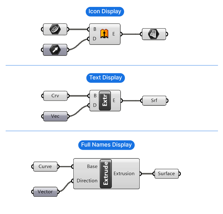
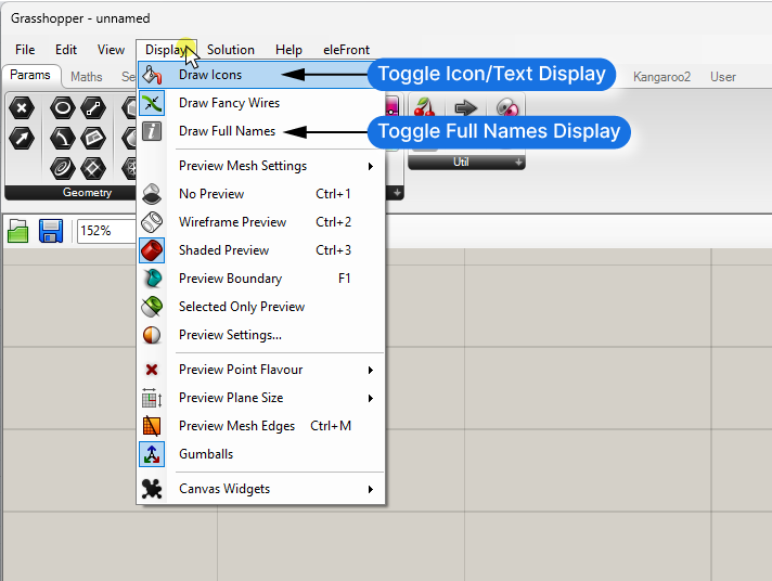
In the menu, under Display, and ‘Draw Icons‘ we can toggle the graphical display of the components.
Usually people start out with the graphical icons and later on move to the text display. Personally, I find the abbreviations more helpful since the icons can be ambiguous. Choose the one that feels more intuitive for you!
Regardless of the component display, the inputs and outputs will be displayed with letters. When starting out with Grasshopper, the letters alone can be confusing. To help with that, we can display the full name of the inputs and outputs, by going to Display in the top menu and selecting ‘Draw Full Names‘.
While this is great for starting out, the components will appear much larger on the canvas. As you get more familiar with the components, you can switch back to the single letter mode.
Moving and Copying Components
Now let’s get comfortable interacting with components in the Grasshopper interface!
To move a component around on the canvas, simply click and drag it.
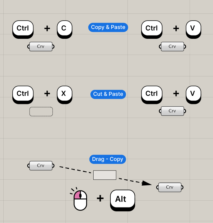
To copy, cut and paste components, use the same commands you would use in a text editor.
Copy and paste any components on the canvas with Ctrl + C and Ctrl + V.
Or cut and paste with Ctrl + X and Ctrl + V.
We can also copy components by clicking and dragging them, and then hitting ALT once. Instead of moving, a copy of the component will be created once you let go.
To delete components, simply select them and hit delete on your keyboard.
Understanding component health
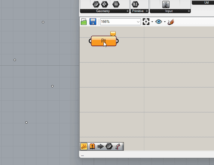
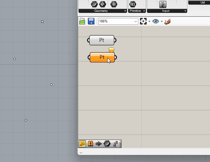
Let’s keep two of the Point components on our canvas.
Now as you may have noticed, when we drop the point component onto the Grasshopper canvas, it turns orange. This is Grasshopper’s way of telling us that something is not quite right.
Grasshopper gives us cues about the “health” of components by coloring them:
- A gray component means everything’s fine.
- An orange component means that one or more inputs are missing.
- And a red component means that something went wrong. Usually because we provided the wrong input.
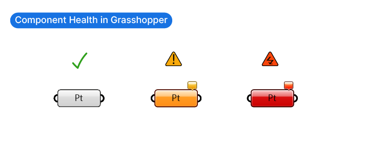
When a component is orange or red, we can get more information on what’s wrong by hovering over the bubble on the top right corner.
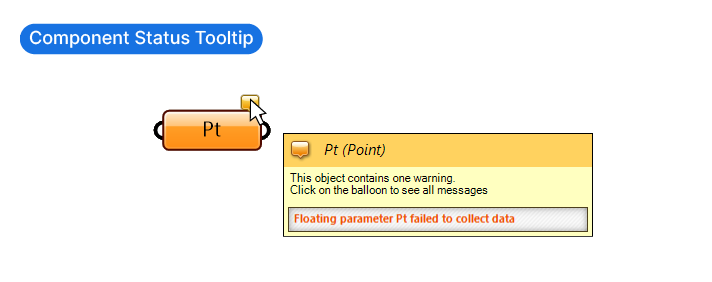
In the case of our point, it says: “Parameter Pt failed to collect data” – in other words there is no input.
To fill them with data, we have two options. We can connect geometry from elsewhere in our script, or we reference geometry directly from the Rhino document.
Let’s learn how to do that.
Referencing Geometry from Rhino
Grasshopper’s possibilities are not limited to the Grasshopper interface. We can seamlessly combine native Rhino objects with parametric Grasshopper geometry by referencing geometry.
To reference geometry means creating a link between actual geometry in our Rhino file, and Grasshopper. If we move the geometry in Rhino, Grasshopper will pick up on it and update the script accordingly. This adds another layer of interactivity to our scripts!
Let’s learn how to do it:
Let’s create four points in the Rhino top view. These will be the points we’ll reference.
To reference geometry in Grasshopper, right-click on the container component you want to link to Rhino geometry. Make sure the data container matches the kind of geometry you intend to reference to it. In our case we have a point container and can only reference points.
In the dropdown menu, chose between “Set one point” or “Set multiple points“. Let’s select ‘Set one point’. As soon as we click, the Grasshopper window will minimize – that’s normal! It’s to clear the viewport so we can make our selection more easily. Let’s select the first point.
Done. The link is now created. The Grasshopper window will reappear as soon as we make the selection, and the component turns gray.
You can also select the geometry in Rhino first, and then right-click on the component and click set-one-point. The result is the same.
Referencing Multiple Objects
We can also reference several points to the same component. To do that, go to “Set multiple points“, select the remaining points, and then right-click to confirm the selection. The point component will then contain multiple referenced points.
By hovering over the output we can check how many points each component contains.
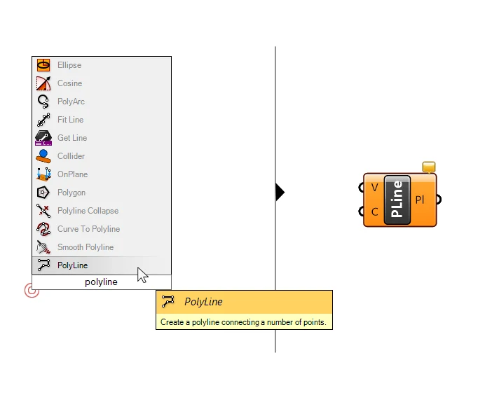
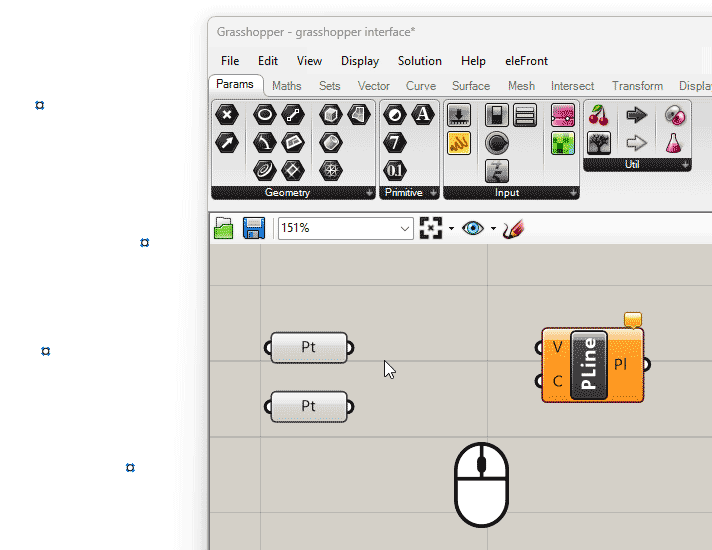
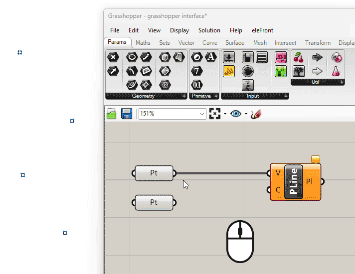
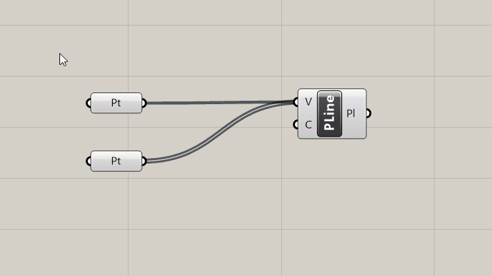
Now let’s create a polyline that connects these four points.
We could go to the component tabs and look for the component, but it’s easier to simply double-click and type “Polyline“. Let’s hover over the first result to check if it does what we want, and then drop it on the canvas by clicking on it.
Understanding Inputs and Outputs
As we delve deeper into the Grasshopper interface, understanding component inputs and outputs becomes crucial. Components in Grasshopper can have multiple inputs and outputs. The inputs are on the left, and the outputs on the right. This is the only direction the information will flow!
We can find out what the required inputs are by hovering over them with the mouse pointer.
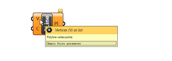
The polyline component for example, asks for the vertices (points) to connect with the polyline in the input V (for Vertices).
While the letters on the inputs give us a hint about the required input, it’s always good to check what the required inputs are by hovering over them. When starting out, connecting the wrong inputs is one of the most common mistakes! If a component turns red upon creating the connection, this is most likely the reason.
When in doubt, hover over both the output and the input of the components you are trying to connect and make sure they contain the same data type!
Predefined Inputs
Back to our Polyline component. The input C (for Closed) asks us whether we want to create a closed curve or not. By hovering over the ‘C’ input of the Polyline component, we can see that it already has a default value, which is ‘False‘.
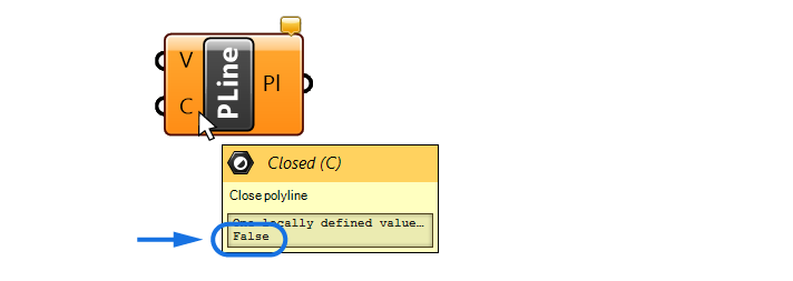
In Grasshopper, True or False values are called “Boolean Values“. They specify whether an option should be on or off. Since the default input of the “Closed” input of the Polyline is False, it means that the polyline won’t be closed. In other words, the two ends of the curve won’t be connected.
Some Grasshopper components will come with predefined, default values. In that case we only have to provide an input if we want to change them.
It’s just like running commands in Rhino: there are several additional options in the command line and usually these options have a default value.
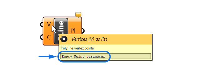
The ‘V’ input of the Polyline component (the points to connect with the polyline), says “Empty Point parameter” in the tooltip, which is Grasshopper’s way of saying that there is no data / no input.
Let’s change that by connecting our referenced points!
Creating Wire Connections between Components
Components alone are like static building blocks of our scripts. Only by creating connections between them we can bring them to life by allowing the information to flow through!
Let’s learn how to connect components.
We are going to feed our referenced points into the vertices (V) input of the polyline component.
To create a connection, simply move your mouse to the output of the first component, until a little arrow appears, then click and drag to create a wire. As you drag it closer to components, it will snap to any available input. Let’s connect it to the Vertices (V) input. Just let go to complete the connection.
To remove a connection, press Ctrl while repeating the exact same maneuver: click and drag the wire from output to input of the components you want to disconnect. A small red arrow and a minus sign will let you know that the connection will be removed. Make sure to keep pressing Ctrl until you let go of the mouse button.
We successfully connected the point.
But the polyline component is still orange, let’s see what it says. By hovering over the orange bubble we see that it says “Insufficient points for a polyline”. And that’s true, we can’t create a line from a single point.
Connecting multiple inputs
So let’s feed the remaining three points stored in the second point container into the same input.
If we connect the second point container in the same way, you’ll notice that the previous wire disappears. That is the default wire behavior: any new connection will replace the existing one.
If we want to add the input to the existing one, we need to press Shift as we create the additional connection. Click and drag, and additionally press Shift before letting go of the wire, you will see a small green arrow and a little plus icon appear. This way both points are added to the input.

It’s important to note that whenever we are adding multiple inputs, the order in which we plug the points into the Polyline input will determine the order in which the points will be connected by the polyline.
Since we referenced the points from Rhino, if we move a point in Rhino, the polyline will automatically be updated!
Baking Grasshopper Geometry to Rhino
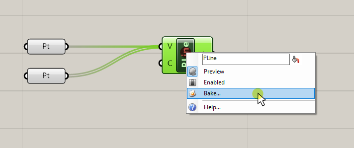
As we referenced the points and created the polyline, it showed up in the Rhino viewport. You probably noticed that we can’t select this curve in Rhino. The reason is that everything we create in Grasshopper remains a preview in the Rhino viewport until we export it into the Rhino document.
Exporting Grasshopper geometry to Rhino is called “baking” in Grasshopper.
We can bake any geometry we created in Grasshopper by selecting the component that contains it, right-clicking, and selecting bake.
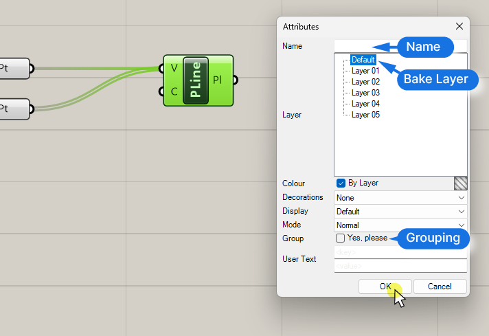
The pop-up window that will appear allows us to specify which layer we want to bake this object to, and on the bottom, whether we want to group the objects, in case of multiple objects. On top, we can give the object a name. Click ‘OK’ to confirm.
Now the curve is converted into a native Rhino object and we can select and manipulate it in any way we want.
It’s important to note though, that this baked geometry has no connection to the Grasshopper script anymore! If we move it to the side, we can see that the grasshopper preview is still in the same place, unchanged.
Customizing the Preview
To master the Grasshopper interface, we need to be able to control one of its main features: the preview.
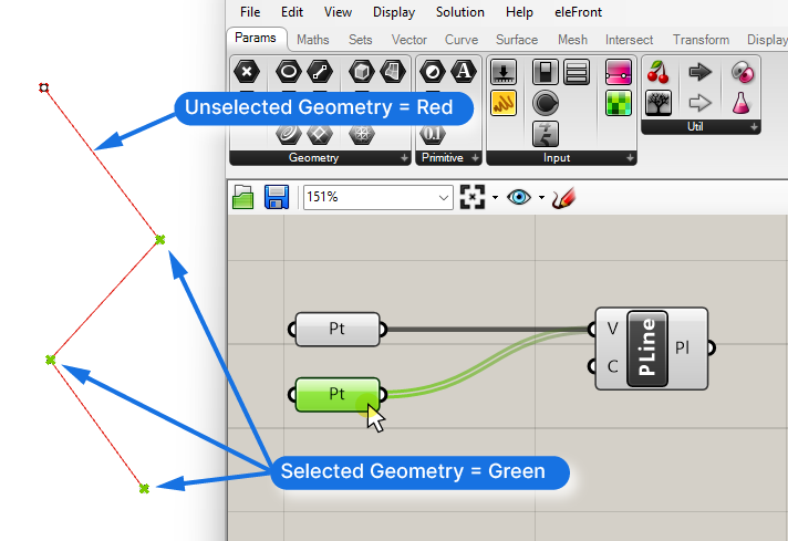
By default, all Grasshopper preview geometry in the Rhino viewport is displayed in red. If we select one or more components, their contents will be highlighted in green. It’s a quick way to see which component generated which geometry.
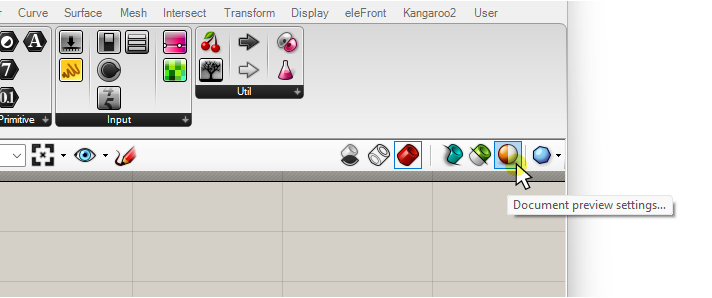
You can change the default preview colors by clicking on the ‘Document previous settings’, the orange/white circle in the top right corner of the Grasshopper canvas.
We can change the color but also the transparency of the preview. The transparency is controlled with the bottom slider (A). Below, I changed the unselected preview color to blue and the selected preview to magenta.
I find it most helpful to remove the transparency entirely to get the equivalent of a shaded mode in Rhino.
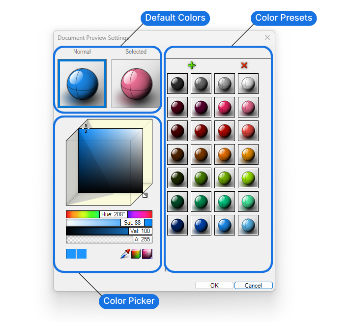
If we change the preview colors here, the settings will only be saved for the current Grasshopper script. Creating a new Grasshopper file will reset to the default red and green previews.
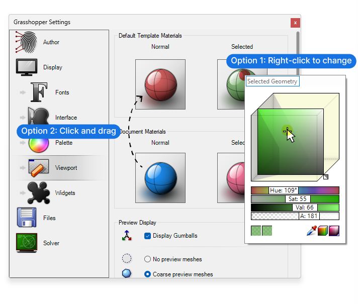
To change the default preview colors for all new files, we can go to File > Preferences and navigate to the viewport section.
Here we see four spheres. On top, under “Default Template Materials”, are the default preview colors and on the bottom (“Document Materials”) the ones of the current script. We can change the default color and transparency by right-clicking on the spheres. If you’ve customized the preview in the current document, you can also click- and drag the colors from the bottom spheres.
Turning the preview of Components on and off
By default, any component we add to our script will be previewed in the Rhino viewport. While this works as long we only have a handful of components, once our scripts get more advanced, all the overlayed previews will make it impossible to see what’s going!
It’s the equivalent of displaying all the intermediate steps leading up to a final geometry, when all we want to focus on is the final output!
To help with that, we can disable the preview of individual components. We can disable the preview by right-clicking on components and toggling the “Preview” option in the pop-up menu.
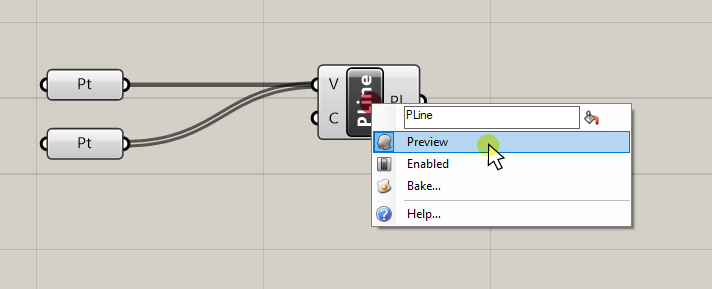
To differentiate components that are previewed from those that aren’t, components with deactivated preview are shown in a darker shade of gray.
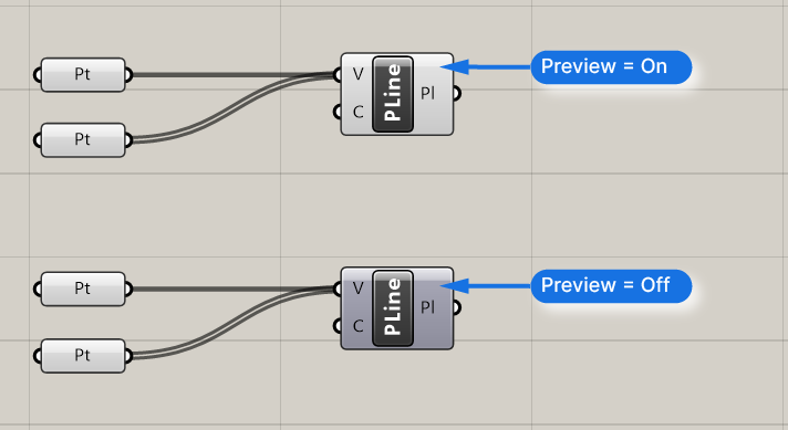
We can turn off the preview of multiple components at once, by selecting them and pressing Ctrl + Q. This shortcut will toggle the preview, meaning that if we press Ctrl + Q again, the preview switches back on.
So if we want to hide the preview of the referenced points, we select them, and hit Ctrl + Q.
Preview Modes
In some cases we’ll want to quickly turn off the preview of all components or only preview a single component to check if it works as expected. Turning the preview of all components on and off manually would be a bit awkward. Luckily Grasshopper offers additional preview modes.
We change how the preview of Grasshopper geometry is displayed in the Rhino viewport with the buttons on the top right corner of the Grasshopper canvas.
The first three buttons control how the preview will be shown in the viewport, much like the Display Modes in the Rhino viewport.
The first one will disable the preview of the entire script.
The second one will show the preview geometry in wireframe mode, just like the Wireframe view in the Rhino viewport. And the third, red one, which is the default, will give us a normal, shaded preview.
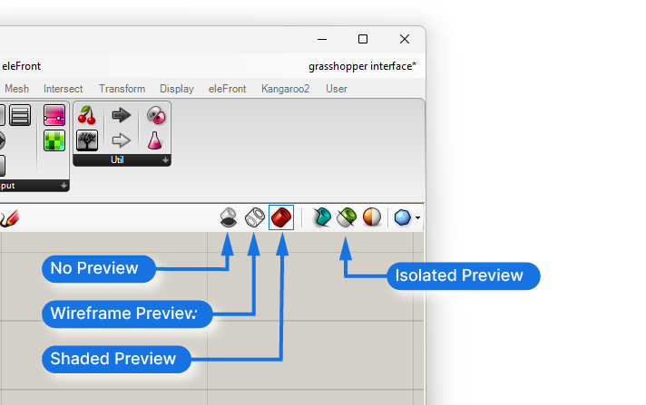
To isolate the preview of specific components, we can activate the isolate preview mode – the half-green- half-white cylinder. Once pressed, the preview in the viewport will only display the preview of the components currently selected on the Grasshopper canvas. This will be helpful in more elaborate scripts to understand which component contains which geometry.
Click the same ‘Isolate Preview’ button once more to disable the isolate preview mode.
Keeping Your Grasshopper Definition Organized
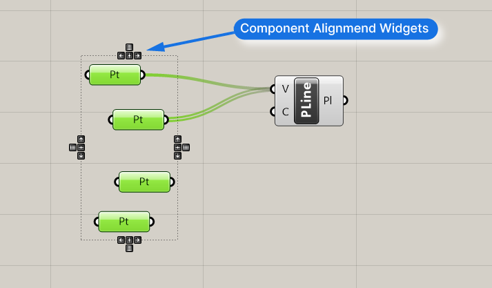
A drawback of the Grasshopper interface is that without some house-keeping, we risk ending up with a jungle of components and wires. To make sure we (and others after us) can makes sense of the script, it’s a good idea to take some time to align and organize components.
When we select more than one component, a dashed bounding box with small black alignment widgets appears. We can use the arrows to align the components along one edge and space them out equally.
We can create space to add more components in-between existing components by holding down the ALT key and then clicking and dragging. This will shift all the components horizontally, to the right or left.
To use the same command to shift components vertically, press and hold the ALT key, start dragging, then hit the ALT key once again. This way you can shift all the components to up or down.
Grouping Components
It’s best practice to group components and label them to clearly mark the different sections of a script within the Grasshopper interface. That way it will be easier for yourself and others to understand the different parts of a script.
To group components, select the components you want to group, and hit Ctrl+G.
Click anywhere in the group and click and drag to move the entire group.
By right-clicking anywhere into the group we can add a descriptive name in the top field of the pop-up menu. We can also change the color of the group from the default yellow to a custom color, by right-clicking, going to ‘Color’ and adjusting it there.
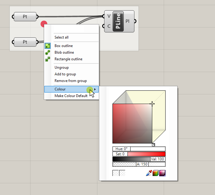
To make the selected color the default color for any group you create in the future, right-click in the group once more and select ‘Make Colour Default‘.
Final Thoughts on Mastering the Grasshopper Interface
And there you have it! You’ve now mastered the Grasshopper interface, and you’re now equipped with the knowledge to navigate, create, and manipulate your own scripts. But remember, this is just the beginning. The world of Grasshopper is vast and full of potential, and you’ve just taken your first steps into a larger universe of parametric design.
If you found this guide helpful and you’re eager to dive deeper, consider checking out our comprehensive online course: Grasshopper Pro. It’s designed to take you from Grasshopper beginner to advanced user, unlocking the full potential of architectural design with this powerful tool.
But before you go, we have a gift for you. To help kickstart your Grasshopper journey, we’ve created a free guide packed with tips and tricks that will accelerate your learning process. Download it, keep it handy, and refer back to it as you continue to explore Grasshopper.
Thank you for choosing to learn with us. We’re excited to see where your Grasshopper journey takes you. Remember, every great architect was once a beginner. Keep learning, keep creating, and most importantly, have fun along the way.
We look forward to seeing you again soon!