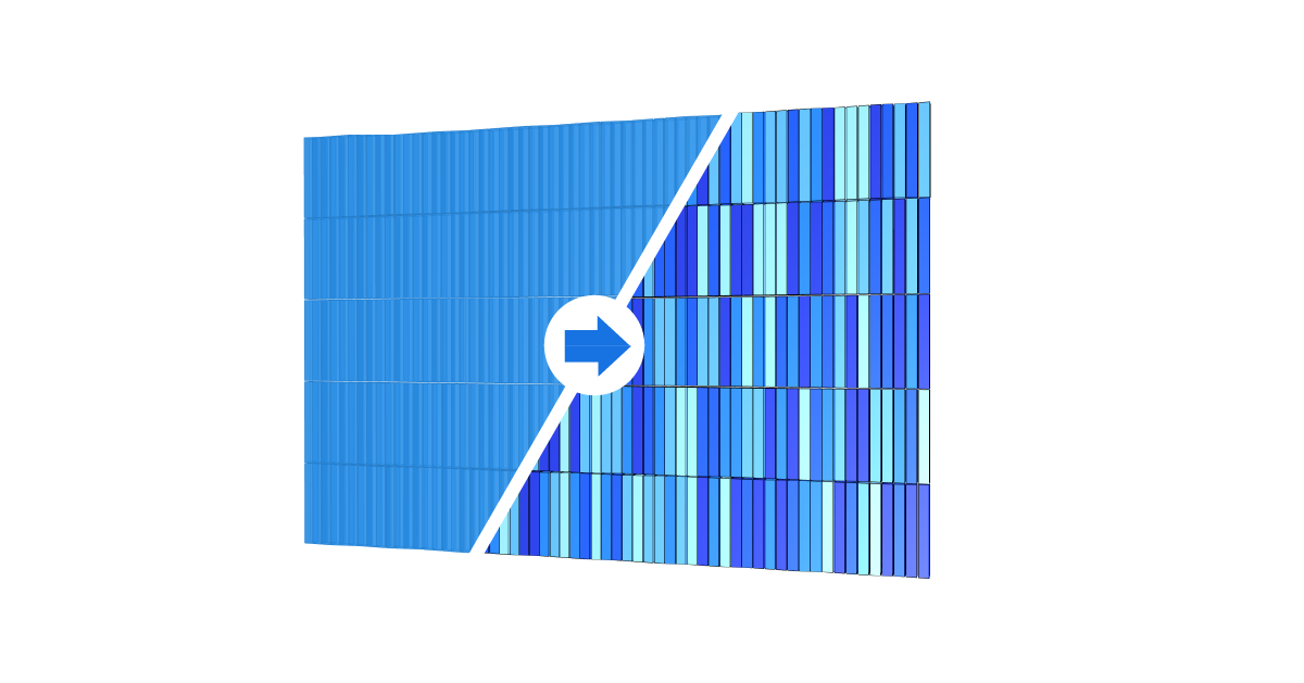
Design is not just about shape, it’s also about colors. The whole point of Grasshopper’s visual programming approach is to see the live, 3D preview next to the script we develop. But as the complexity of our script grows, the default red and green preview colors are no longer sufficient to evaluate our designs. In this guide, we’ll delve into the use of the Grasshopper Custom Preview feature. With a combination of settings and components, we’ll learn of ways to enhance the way we visualize and interact with our designs with custom colors.
Let’s jump right in!
How to Customize Grasshopper’s Default Preview Colors
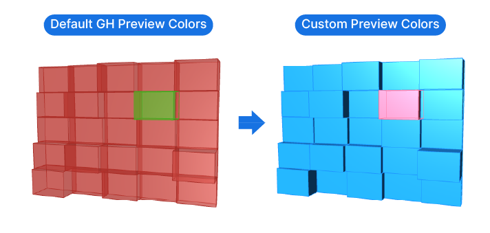
Red and green – Grasshopper’s almost iconic colors make it easy to distinguish the preview of selected, and unselected objects in our scripts. The semi-transparency of the preview allows designers to see as much of the generated geometry as possible at once.
However, as the complexity of our scripts increases, differentiating the quality of a design using only hues of red becomes challenging, especially with the added factor of transparency.
The good news is, Grasshopper gives us the ability to modify the preview colors and even to establish new default colors.
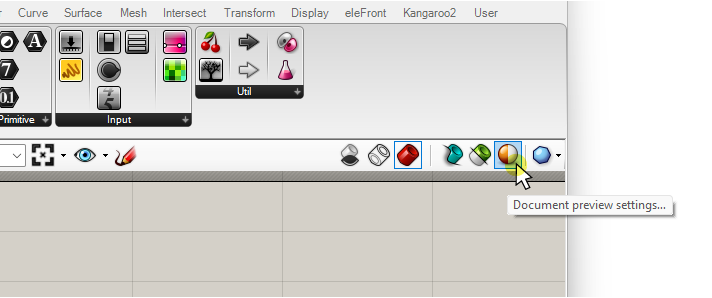
To change the default preview for selected and unselected objects, go to the top right corner of the Grasshopper canvas and click on the second to last button.
The appearing tooltip will say ‘Document Preview Settings…’.
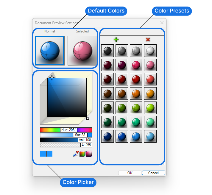
In the pop-up window, you’ll be able to customize the colors for the ‘normal’ and ‘selected’ display of Grasshopper geometry.
Customizing the Preview Color and Transparency
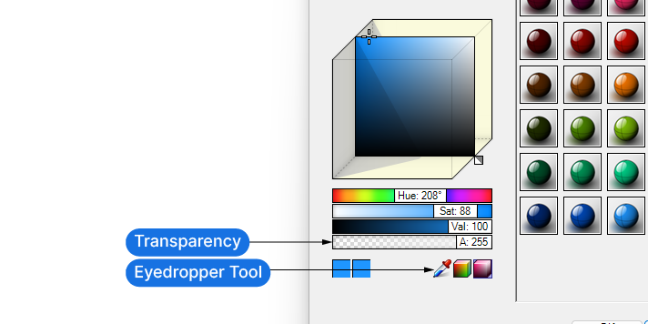
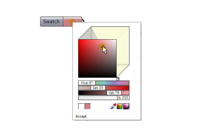
Choose a color from the right-hand side and drag it onto one of the two spheres on the top left to replace the current color.
To define a new, fully custom color, use the color picker below the two spheres.
Besides the Hue, Saturation and Value, the fourth slider, labeled ‘A’, controls the transparency of the object. To get a fully ‘solid’ look with no transparency, move the slider all the way to the right, or to a value of 255.
The Grasshopper preview will now look more like a shaded object inside Rhino itself, which can be useful to evaluate a design before committing to baking it.
Hit ‘OK’ to confirm.
Keep in mind that these settings are document specific. This means that anyone opening a Grasshopper file where the preview colors have been modified, will see them. And conversely that any new Grasshopper file will revert to the default red and green preview colors.
How to Permanently Change Grasshopper’s Default Preview Colors
To permanently change the default preview colors, we have to change the Grasshopper preferences.
Go to File / Preferences and then go to the ‘Viewport‘ section.
In the menu on the right you’ll see 4 spheres. The two spheres on the top represent the Grasshopper default colors for the normal and selected objects, and the two spheres below the same but for the current document.
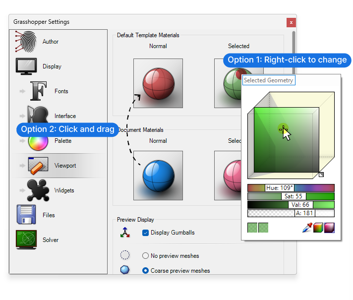
To change the default colors, you have two options:
Right-click on the top two spheres and a color picker will pop up. Change the color there.
Alternatively, if you have adjusted the colors at the document level and you want to now make them the default, click and drag the ‘colors’ from the bottom spheres to the ones above.
Close the settings to complete the command.
Congratulations! You now have custom preview colors for any new script you create!
How Change the Preview of Individual Grasshopper Objects with the ‘Custom Preview’ Component
Customizing the preview colors as shown above, has some limitations. You are still stuck with only two colors to preview any design you are developing. When different colors are a key feature of a design, we need a way to visualize the colors in the preview.
The solution? We can specify the preview color of any object in our script with the help of the ‘Custom Preview’ component.
To add it to your script, double-click on an empty spot on the canvas, type ‘Custom Preview’ and select the component from the list.
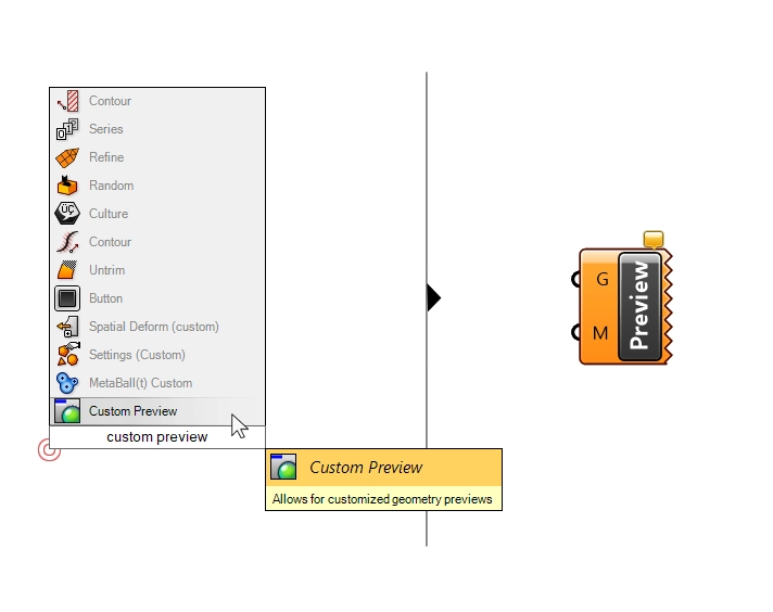
The component looks different from other Grasshopper components: the right-hand side has no outputs and instead displays a jagged edge. The reason is simple: this component is a ‘dead-end’ component. It’s only output is the preview in the Rhino viewport.
The Custom Preview component has two inputs: the Geometry to customize the preview for (G) and the material or color to override it with (M).
To apply the custom preview to objects, connect them to the ‘G’ input.
By default you’ll get a pink preview. Let’s change that.
Method 1: Applying a Custom Color to the Grasshopper Preview
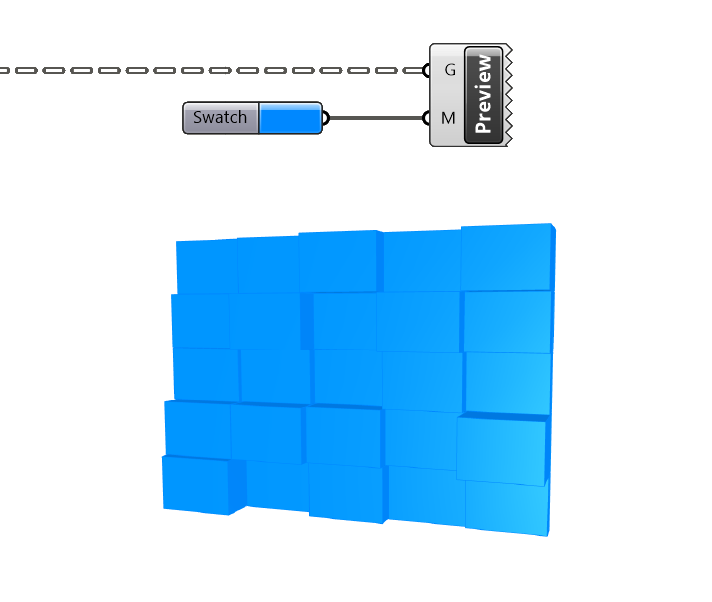
To define a specific color, we need to add a ‘Colour Swatch’ component to our script. Type its name into the component search bar to add it.
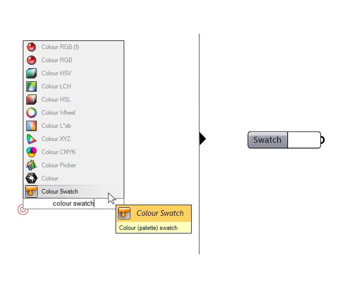
Clicking on the colored portion of the component will open a color picker popup. Edit the color there. You can even use the color picker and pick any color presently visible on your screen.
Once connected to the ‘M’ or material input, the Custom Preview component will do its magic and override the default Grasshopper preview color in the Rhino viewport.
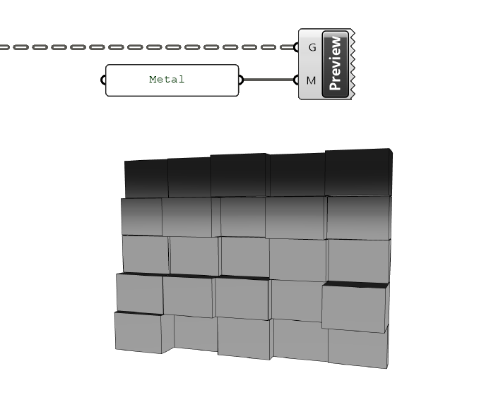
Shown below the Custom Preview component applied to a subdivided surface script.
For a seamless experience, it’s recommended to turn off the preview of the components are connected to the Custom Preview component, to avoid preview conflicts.
Method 2: Applying a Custom Material to the Grasshopper Preview
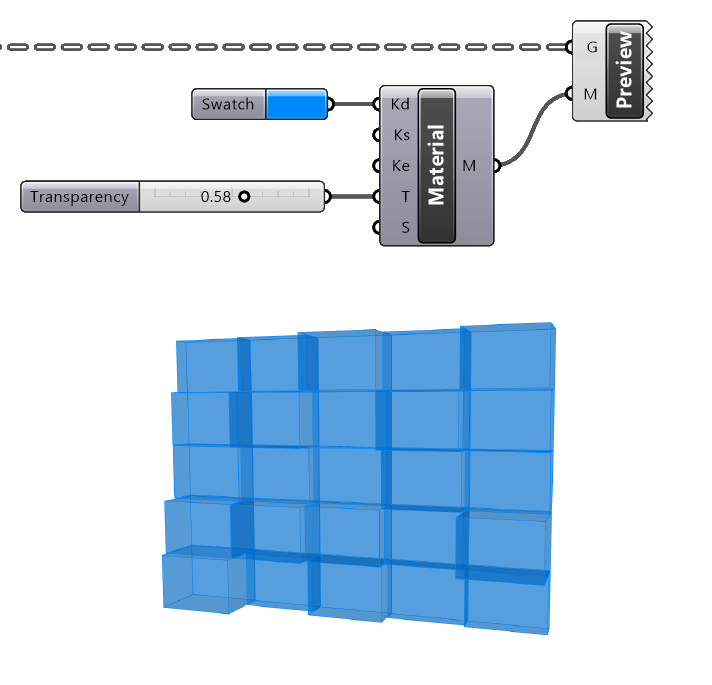
Instead of a color, we can also define a fully fledged material. The component we’ll need for that is called ‘Create Material’.
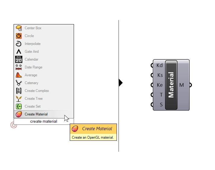
With this component we can specify material properties like the diffuse color (Kd), specular color (Ks), emissive color (Ke), the transparency (T) and ‘shininess’ (S). Use Number Sliders to define the properties.
While the ‘Create Material’ component gives us some options, the resulting material is still very basic.
Method 3: Using Materials From the Rhino Document for the Custom Preview
A third, little known trick, is to apply a material from the Rhino document to the Grasshopper preview.
Here’s how to do it:
- Step 1: Create a material in the Rhino document and copy its name.
- Step 2: Add a Panel to the Grasshopper script and paste in the material name.
- Step 3: Finally connect the Panel to the Material (M) input of the Custom Preview component.
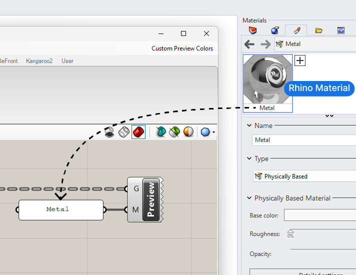
The Grasshopper Preview will now be displayed in that material. It will reflect the Rhino material’s color, transparency, reflectivity etc. even the textures!
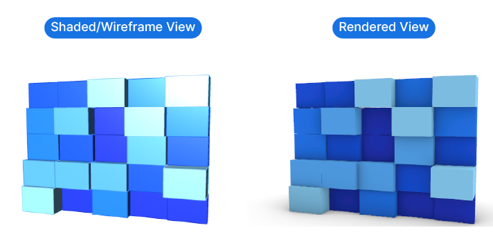
Displaying Custom Previews in Rhino’s Rendered Display Mode
Besides showing Grasshopper geometry in custom colors in the viewport, the Custom Preview component has an extra feature:
It allows us to preview geometry in Rhino’s ‘Rendered’ mode. While the normal Grasshopper preview will still show when the ‘Rendered’ mode in the Rhino viewport is activated, the geometry won’t cast any shadows, resulting in a flat appearance.
The Custom Preview component changes that:
All geometry plugged into the Custom Preview component will be sent to the render pipeline and will now cast and receive shadows in the rendered view. This way the preview seamlessly interacts with any Rhino geometry in the document.
If we don’t want the specific Custom Preview geometry to show in the rendered view, we can right-click on the component and remove the checkmark next to ‘Render’.
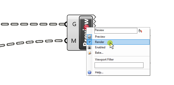
This ‘rendered’ preview is independent from the preview option of individual components. This means that even if all the components have the preview disabled, the Custom Preview will still show geometry in the rendered view, as long as the ‘Render’ option is on.
How to Preview Edges in Grasshopper
While all preview modes mentioned so far allow us to change the color of objects, they don’t differentiate between ‘faces’ and ‘edges’. The entire object will be displayed in that color. Usually the edges are shown in a slightly darker tone.
Sometimes it can be of help to display the edges of Grasshopper geometry in a darker color, to clearly delineate the border between objects.
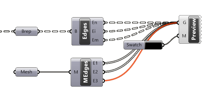
A simple way of achieving that is to extracting the edges of the objects in question and then adding a custom preview component with a specific color just for the edges, for example black. Use the ‘Brep Edges’ component for Breps and ‘Mesh Edges’ for meshes.
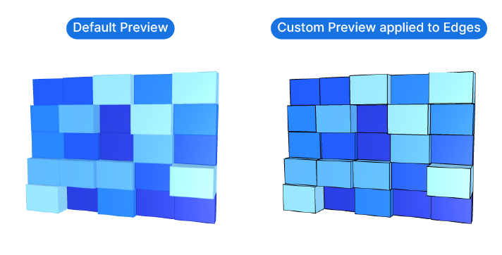
Combined with the removal of the preview transparency, these darker edges create geometry in the Rhino viewport that is almost indistinguishable from native, shaded Rhino geometry. This can facilitate the design process, as no baking is necessary to see the scripts ‘final form’.
In conclusion
Using a custom preview in Grasshopper allows for a more nuanced and detailed visualization of our designs. By moving beyond the default red and green colors, we can customize the preview colors of our scripts, making it easier to evaluate complex designs. The ability to permanently change the default preview colors, apply colors to individual objects, and preview edges in Grasshopper further enhances the design process.
The ‘Custom Preview’ component enables us to specify the preview color of any object in our script. By assigning colors or materials to different objects, and controlling the edge color, we can visualize the design without the need to leave Grasshopper.
Now, it’s your turn to apply these insights and elevate your design process. Harness the power of Grasshopper’s custom preview to bring your designs to life.
Happy designing!